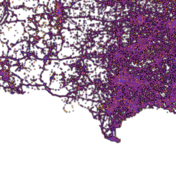
UK's (Manchester) Guardian Maps All US Fatal Road Crashes 2001-2009
A sobering view from Britain, as they look at our road death rate. If you look at the US as a whole, you're pretty much hosed if you live anywhere east of the Mississippi or in southern California. You may survive if you live in parts of rural Nevada or Montana. The map is searchable (put "Chicago" in the search box) and breaks out motorists' fatalities, passengers, cyclists (green symbols) and pedestrians/other. If you zoom in enough, the icons list age and gender of each of the dead. Unfortunately, it doesn't seem to be able to filter out everything but the cycle fatalities, which may interest many of us, but it's still interesting to look at, particularly to see which intersections on your route pose specific danger. The icon key is at the upper left of the map.

And if you think they're being unfair by pointing at the USA, they previously did the same analysis of British crash fatalities.

Views: 194
Replies to This Discussion
-
Permalink Reply by Joza 7 miles on
-
Thank you for posting this.
-
Permalink Reply by S on
-
It's interesting although I'm not sure what it's shows aside from the fact that areas with more people using the roads have more accidents. The west have very few accidents because there's almost no one living there.
It'd be more interesting if they did a per capita map or something similar so that we can see which areas have the most accidents for a given population (due to bad drivers, roads, weather, whatever).
-
Permalink Reply by Steven Vance on
-
I think one of the purposes of the map is just shock value: There are too many crashes. End of story. It's the number one cause of death in America for teenagers (35% of all deaths, 1999-2006). For all of America, it's in the top 15, killing more people than chronic liver disease or cirrhosis. (I did find some research that said the youth mortality rate in auto crashes is higher in Mountain and Southeastern states and lower in the New England and Middle Atlantic states.)
Around the world, traffic crashes are the leading cause of death for people 10-24.
I published more of my comments about this map and what it represents on Grid Chicago.
Traffic crash deaths are generally declining, but I want it to decline faster.
S said:It's interesting although I'm not sure what it's shows aside from the fact that areas with more people using the roads have more accidents. The west have very few accidents because there's almost no one living there.
It'd be more interesting if they did a per capita map or something similar so that we can see which areas have the most accidents for a given population (due to bad drivers, roads, weather, whatever).
-
Permalink Reply by Thunder Snow on
-
Steven: thanks for your Grid article. You've expanded upon the Guardian articles really well. Your bike fatality map is excellent info for Chicago, but it stops short at the city borders. The Guardian map shows me areas that I bike in regularly, between Waukegan south to Evanston, and west through Skokie, Lincolnwood and Morton Grove, which is quite useful to us country bumpkins.
And thanks for the additional UK posts, h'. I got really excited when I saw the words "cyclist superhighways", imagining a network of controlled access cycling roads like our Kennedy or Dan Ryan, reserved just for bikes. But it appears that the British are just painting the cycle lanes blueand aren't protected from cars swerving or passing in the cycle lanes in any way. They are two-way bike lanes, which I would guess would lead to more head-on cycle crashes, as well, as they look very narrow.
-
-
The problem I have is that if you increase the population, you'd get a corresponding increase in the number of deaths and crashes. So the map is just letting us know where the most people live.
I understand what you're saying when you say that it's the leading cause of death in certain populations, but I think that's because we've done a pretty good job of preventing deaths from other causes. Most healthy people in the prime of their lives simply don't die of age related diseases or medical conditions. Likewise, they're old enough that they can fight off diseases for the most part. So that leaves accidents, suicide, and murders as the leading causes of death. We should work to reduce the number of deaths (and it looks like dealing alcohol and inexperience with driving is the easiest way) but as long as there are deaths there's going to be a leading cause.
Steven Vance said:I think one of the purposes of the map is just shock value: There are too many crashes. End of story. It's the number one cause of death in America for teenagers (35% of all deaths, 1999-2006). For all of America, it's in the top 15, killing more people than chronic liver disease or cirrhosis. (I did find some research that said the youth mortality rate in auto crashes is higher in Mountain and Southeastern states and lower in the New England and Middle Atlantic states.)
Around the world, traffic crashes are the leading cause of death for people 10-24.
I published more of my comments about this map and what it represents on Grid Chicago.
Traffic crash deaths are generally declining, but I want it to decline faster.
S said:It's interesting although I'm not sure what it's shows aside from the fact that areas with more people using the roads have more accidents. The west have very few accidents because there's almost no one living there.
It'd be more interesting if they did a per capita map or something similar so that we can see which areas have the most accidents for a given population (due to bad drivers, roads, weather, whatever).
-
-
I purposefully excluded non-Chicago locations in my crash map because of the amount of data that it entails. I have access to it and can definitely create/modify the maps but the time it takes to do so is a factor.
Does anyone have any ideas on what we should be doing as citizen cyclists and as advocates to reduce the crash and cycling mortality rates?
Thunder Snow said:Steven: thanks for your Grid article. You've expanded upon the Guardian articles really well. Your bike fatality map is excellent info for Chicago, but it stops short at the city borders. The Guardian map shows me areas that I bike in regularly, between Waukegan south to Evanston, and west through Skokie, Lincolnwood and Morton Grove, which is quite useful to us country bumpkins.
Groups
-
Chicagoland Beer Explora…
203 members
-
Wednesday Night for Mort…
1 member
-
Great Lakes Ultra Cycling
270 members
-

Major Taylor Internation…
1 member
-
Critical Mass discussion
261 members
© 2008-2016 The Chainlink Community, L.L.C.
Powered by
![]()