What is up with those new bike racks in Uptown?!?
Don't get me wrong I love the representation of Uptown in any cycling way but the design is horrible. It basically denies you of locking your bike properly!! The whole reason for a bike rack is to lock your bike and now they decided they would do a logo right in between the rack, denying the proper U-Lock wheel and frame locking. Anybody know who to contact to make sure it doesn't happen again or that they do not make every other rack in Uptown the same. I forgot to take a pic but will post one later today.
Views: 1879
Replies to This Discussion
-
Permalink Reply by Josh L. on
-
I live in uptown and noticed that too outside Baker & Nosh. Seems like they did not practice user centric design in their development process.
The new racks in Andersonville outside of Hopleaf (few doors down) are equally awkward. Cool that they are in the street and support diagonal parking for more bikes but the poles are so fat I can't threat my chainstay and get my ulock around the pole.
Therefore we can conclude that only bikers should be allowed to design bike racks.
-
Permalink Reply by Crazy David 84 Furlongs on
-
SOuthport has some "green" painted racks with a logo on them as well. They are next to "normal" racks, so I have not tried one yet, but I wonder if they have the same problem. And yes, many Bike Racks do appear to have been designed by people that do not ride Bicycles. But then this happens all of the time when "artists" design functional things. Consider the United Terminal at O'Hare --- it was considered "cutting edge" when it opened, but it does not perform the basic duties of an airline terminal. Or the Thompson Center, which is hard to heat and cool, does not contain sufficient office space, and is pretty much a functional disaster. (Although it is "pretty" replies the architect). Or one of the proposed designs for the Chicago Public LIbrary -- a large glass table upon which a glass building was to be placed... ignoring the fact that light and heat is bad for books and the building would have a 150 lb per square foot weight limit.
So, yes, likely a bad bike rack. But at least its only a bike rack....
-
Permalink Reply by Adam Herstein on
-
At least they're not as bad at these David Byrn bike racks in New York.
- Attachments:
-
-
 image.jpg, 210 KB
-
-
Permalink Reply by Juan Primo on
-
Haha, none of those bikes are locked well.
Adam Herstein (5.5 mi) said:At least they're not as bad at these David Byrn bike racks in New York.
-
Permalink Reply by Jose Zayas on
-
Thanks for the replies, including the pic from NYC...now that's awkward. anyways here's the pic. Outside of Baker& Nosh where I live. Everything is cool except for the fact that the design is right where you would lock your bike. Anyways enough rambling. Safe riding.
-
Permalink Reply by Madopal (16.5 mi) on
-
I've been saying this for a while about the city-centric racks...the design element is at EXACTLY the wrong height, and it prevents locking. I noticed that on the early pictures of the Wicker Park ones.

I'm all for neighborhood pride, but these racks need to be usable. Putting anything across the middle is a monumentally bad idea.
-
Permalink Reply by Blatherskate on
-
I did a survey about a year ago for "WPB" in which I mentioned the poor design of these racks. They continue to install new ones like this, so perhaps it will take multiple emails to get the hint.
Same goes for uptown.
-
Permalink Reply by Tony on
-
All these racks were donated by chambers of commerce for the benefit of cyclists. Cut them some slack. They're doing it for you.
-
Permalink Reply by Tony Adams on
-
That makes me _less_ likely to cut them slack. If you intend to help someone you really should get to know them enough to make sure that your help is going to be helpful and not just give you some PR and give make you feel like you've "contributed".
Tony said:All these racks were donated by chambers of commerce for the benefit of cyclists. Cut them some slack. They're doing it for you.
-
-
Exactly. These smack of PR. If you want to encourage cycling, that's one thing, but don't pretend to encourage it while making things that actually make it harder. There would seem to be plenty of ways to have a group sponsor a bike rack w/o having to compromise its usability. Color, engraving, decals...I mean, if they're meant to be seen by cars driving by, they're doing it wrong.
I think we should look at the Toronto ones, not just for design but because they'd seem to be perfect for retro-fitting old parking meters:
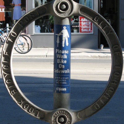
And with all that lettering, there's plenty of room to get creative.
Tony Adams 6.6 mi said:That makes me _less_ likely to cut them slack. If you intend to help someone you really should get to know them enough to make sure that your help is going to be helpful and not just give you some PR and give make you feel like you've "contributed".
Tony said:All these racks were donated by chambers of commerce for the benefit of cyclists. Cut them some slack. They're doing it for you.
-
-
BTW, here's a pick of two bikes locked to the Wicker Park ones. Notice how the bike on the right winds up having to stick out in the sidewalk, and the one on the left has just the right lock size to fit through that little hole in the logo. Also, the logo is exactly the same height as what appears to be a 700 wheel. You'd think they would have tried that before welding it in.
 Have a bigger downtube or smaller lock, welp, too bad. Mini-u? You're out of luck. Go find another rack or leave your wheel exposed.
Groups
-
Chicagoland Beer Explora…
203 members
-
Wednesday Night for Mort…
1 member
-
Great Lakes Ultra Cycling
270 members
-

Major Taylor Internation…
1 member
-
Critical Mass discussion
261 members
© 2008-2016 The Chainlink Community, L.L.C.
Powered by
![]()